default
Creating an App icon for our Gurgle Music App

When it came to creating App Icons for our second App (Gurgle Music), we'd almost forgotten the many hours spent creating and picking from a seemingly endless versions of icons.
We needed an icon before we could submit to the iTunes store. It's frustrating to have an app you want people to be playing but you can't submit for review until the icon has been designed.
We gave ourselves just 24hrs to come up with an icon, and decided we'd go live with whatever we had at the end of that period.
We need to have an icon that will attract attention when viewed in the App Store. At the same time we want it to look good on the home screen of the customer's device. It's not easy to do both with the same design.
Another problem is the icon looks very on a device, than it does on our computer monitor when we are designing it.
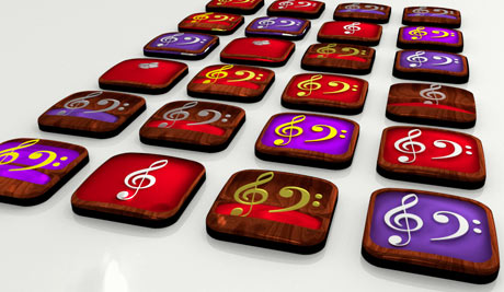
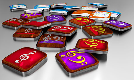
To illustrate what our App is about, without relying on text we decided to use the Treble and Bass Clef symbols. These would be placed in a display case, based on a ring box.

After designing many versions, we came up with 3 main variables. 1. Do we use Gold or Silver Clefs? 2. Do we use Purple or Red Silk for the lining of the box? 3. Do we show the box from above with the Clef lying flat. Or with the Clefs stanging upright and showing the lid of the box?
At the end of our 24hrs we went for Gold Clefs, standing upright in a box showing the lid, with Purple Silk lining. We were not perfectly happy, but it felt was good enough for us to submit to the App Store.
We just had a few programming tweaks before we cold submit. But at least the icon is ready.


